STATIONS OF THE
CROSS BOOKLET
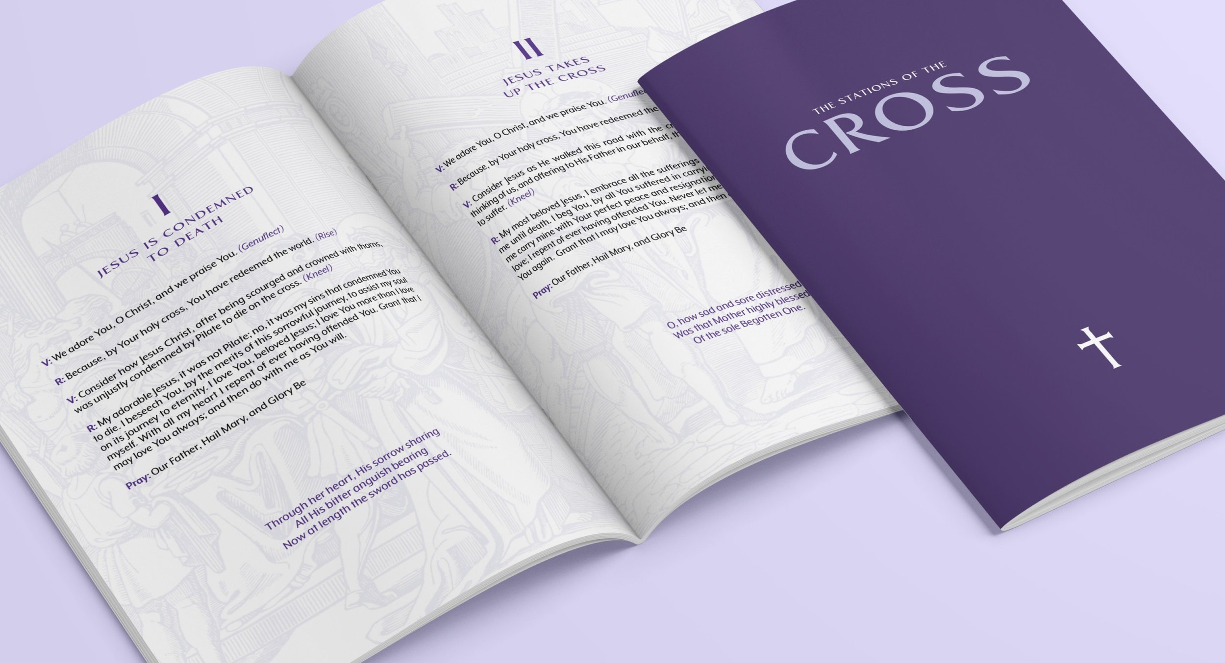
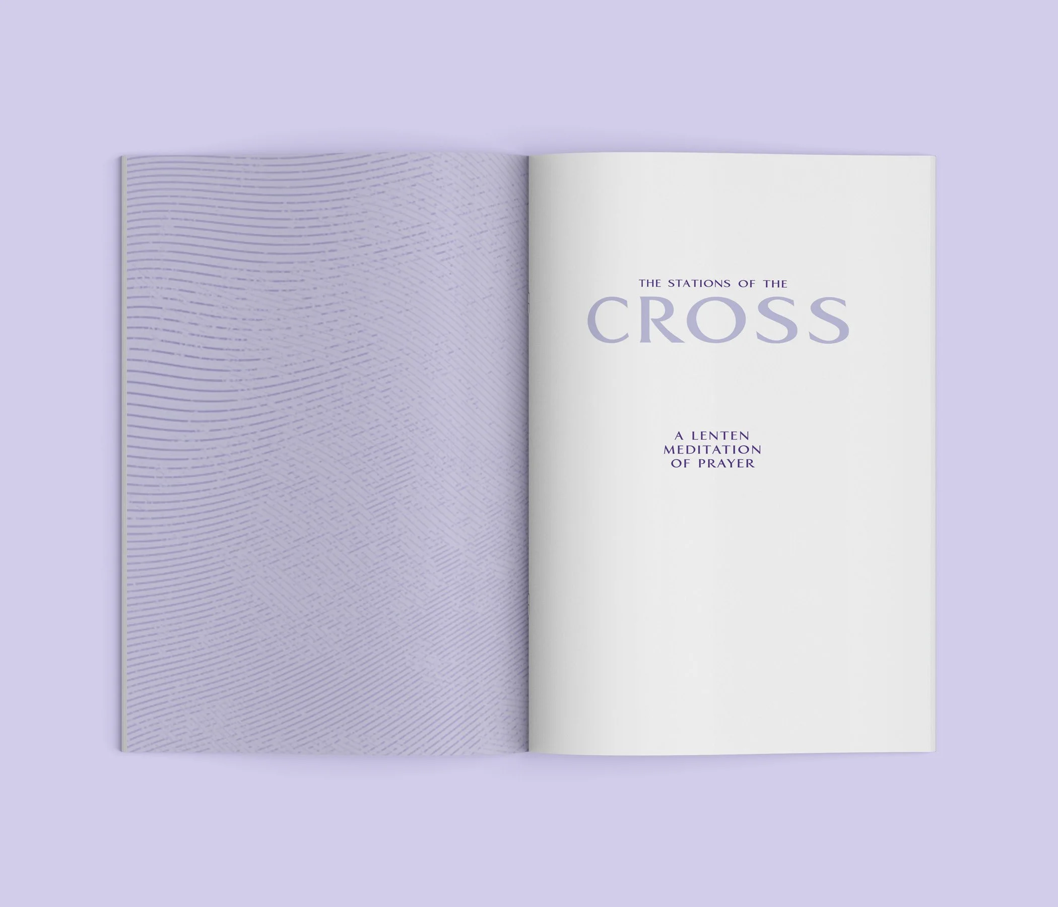
OBJECTIVE For this project, the objective was to design a 5.5” x 8.5” type-dominant chapbook which needed to be bound in our choice. The overall book needed to have between 12 to 20 pages and a cover. The typography needed to have a mixture of traditional typography while still being relevant in typography as of when it was being designed.
SOLUTION When brainstorming what to have my chapbook based on, I decided on creating a personal copy of The Living Stations of the Cross prayer booklet, allowing me to design something not usually done. Due to the booklet being used during the Catholic season of Lent, it led me to use the color of the season, purple. With the plan to keep the layout neatly laid out, I used different fonts, styles, and sizes to create a hierarchy and a legible layout.
***Disclaimer!: Illustrations belong to the two individual artists.***
Click “Process” to view the process doc on Google Drive.


