NICK PITERA
EDITORIAL
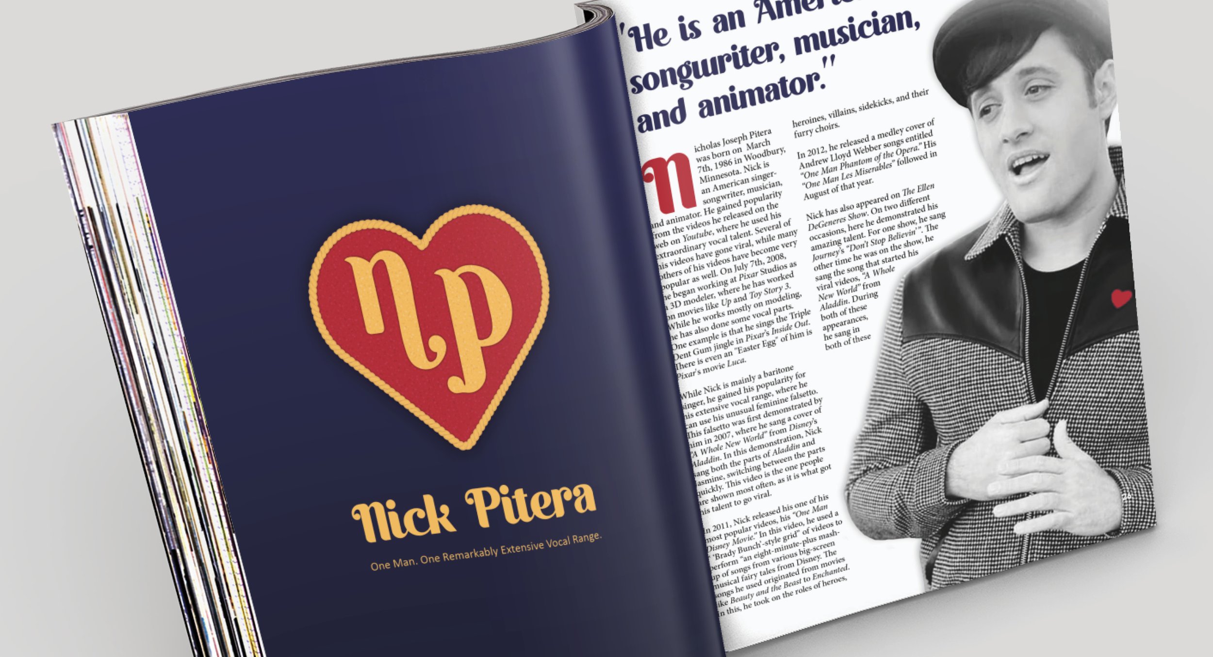
OBJECTIVE For this project, the objective was to design four 8”x10” (two 16”x10” spread) editorial pages. The page designs needed to express a personal interest or an area of expertise of ours. It needed to have a mixture of images, illustrations, and type.
SOLUTION For the topic of my design, the original plan was going to do a design about Neurofibromatosis, a genetic disorder I have, but after hitting a lot of bumps, I settled on creating a design on one of my favorite musical artists, Nick Pitera. The color choice was based on the illustrated heart I created, the colors used helped guide the feeling of the design, and to limit how busy the design could get, the images were adjusted to be in black and white. Any header text or pull quotes is set in a font similar to what the “NP” is in the illustration, using either of the three colors from the cover, the body text, a serif font, is set in black, to allow legibility.
INSPIRATION
The colors used throughout the editorial and cover were inspired by the ‘NP’ heart “icon” that Nick Pitera wore, along with what is similar to a navy-colored commander’s suit, during his song, “Better Days.” While there wasn’t a clear shot at the heart in the music video, I re-illustrated it with whatever glimpses I could use as a reference. To complete the look, I used similar colors that were present on the original heart, as well as adding a texture to it to give a glitter texture that was present in the one he wore. Since the ‘NP’ could have well been illustrated by Nick himself, I found a font similar to it on Adobe Fonts, allowing me to use it for headings, making a visual connection between the pages and cover. This fun and the unique font was Quacker, by Riyadh Rahman.
FOR COLOR
While I could have left each photo throughout the editorial, I chose to change them and use a grayscale color scheme, allowing colors to not clash and to give more of a professional feel. Though some color from the photos did stay, the iconic heart he always wears in his videos, which he is known for, kept its’ color. Another thing Nick is also known for is using a “Brady Bunch” style for some of his songs, which I incorporated into the third page of the editorial, taking the images from his “One Man 90s Disney” medley video.
Click “Process” to view the process doc on Google Drive.


